Color in Oriental Rugs and Textiles, Part 1
Dear folks,
On September 12, 2009, Wendel Swan

gave a Rug and Textile Appreciation Morning program, at The Textile Museum here in Washington, D.C. entitled “Explring and Explaining the Appeal of Color Rugs.”
Michael Seidman

introduced Wendel, saying that Wendel is a long-time, passionate collector of oriental rugs and a well-known figure in the international rug world. He was for some time the president of the Washington, D.C. area rug club and has been active in the International Conference on Oriental Carpets, serving as the head of the local organizing group that successfully presented ICOC-X in 2003. Wendel is the Chair of the ICOC Executive Committee and is currently working on ICOC-XI, to be held in the summer of 2011, in Stockholm. Wendel is also a member of The Textile Museum’s Board of Trustees and has presented frequently, both in the RTAM setting and to rug clubs and in rug conferences world -wide.
Wendel began with an interactive, PowerPoint assisted lecture,

then illustrated some of his points with “in the room” examples.
In addition, members of the audience had brought pieces in.
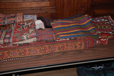
This virtual version of Wendel’s session is divided into two parts.
This is Part 1 and will present, as faithfully as we can manage, a virtual version of his lecture.
Part 2 will be devoted to showing you the pieces “in the room” and to comments on them.
Here is Part 1, Wendel’s PowerPoint presentation.
“This is a program in which I want to explore and explain, I hope, the appeal of color in oriental rugs and textiles.
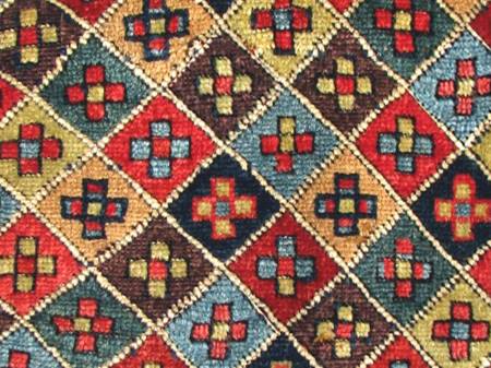
It will be an interactive program in which I will ask you for your comments.
So please shout out your responses or any questions you may have.
Whenever rug qualities are discussed, the mantra


is invariably used, just as “location, location, location” is used when discussing real estate.
While it may be the most important factor in rugs, color is an extremely complex phenomenon.
Collectors often associate superior color with natural dyes.
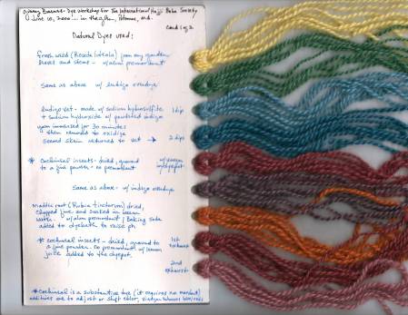
while the quality and properties of wool

affect our perception of color and clearly influence our preferences.
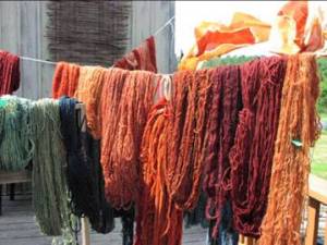
Color, of course, may refer to individual hues of which we all have favorites.
However, what we might call a single color is often more like a musical chord. Take this example.
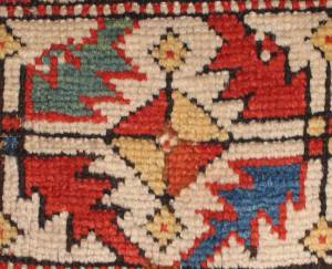
The blue in this motif
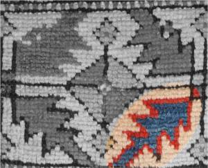
Is actually composed of various hues of blue, from light,
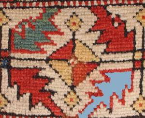
to medium,
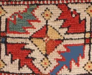
to dark.
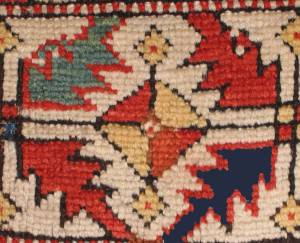
By itself, this blue has what we will later call “contrast of saturation.”
As to individual colors, I think this medallion is fantastic

in part because of the exquisite purple ground.
Even though I love the purple in the medallion,

I don’t own a purple hat.
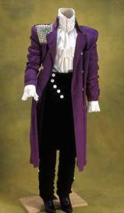
or a purple coat…and the reason is context.
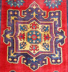
This medallion is part of a fabulous rug at the Vaklifar Museum in Istanbul…which so captured my imagination that I put it on my coffee mug.

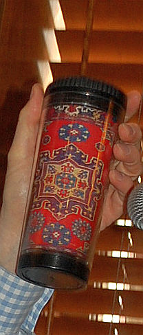
Perhaps my predilection for purple in rugs is partly due to the learned convention that purple is associated with greater age and, therefore, those rugs with purple are more desirable. But the purple is not the only reason I think this is such a great rug. I’ll return to it later.
Today I want to explore the appeal of “color in context” and some aspects of “color theory,”



not color symbolism, or color as an indicator of age, or the qualities of dyes, or about preferences for certain colors such as purple.
We’ll focus on how color contrast, or more properly, color contrasts (in the plural)


are essential to creating some of the most beautiful and dynamic textiles such as the stunning Central Asian silk velvet ikat panel below.
If beauty is in the eye of the beholder,

So is color.
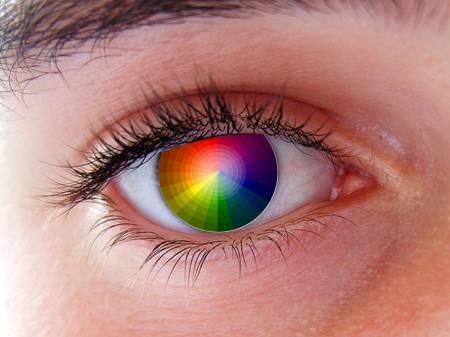
In essence, colors don’t exist. They are “perceived.”
Perception of color stems from the varying cone cells in the retina to different parts of the spectrum.

So colors may be defined and quantified by the degree to which they stimulate these cells.
Because of individual differences in those cone cells, we all perceive color differently, some of us quite differently.
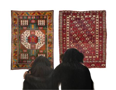
Our individual perceptions, undoubtedly relate to our individual preferences.
In fact, let’s experiment a bit with some standard tests of differences in perception. The “circles” below are parts of Ishihara tests for color blindness first developed in 1917.
I am going to show you each of four circles in turn. Each of them is diagnostic for a particular kind and degree of color blindness.
Here is circle 1:
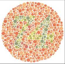
Do you see a number in it? If you see a number, what number do you see?
(Scroll down for the “book answer.”)
|
|
|
|
|
|
|
|
|
With normal color vision, one should see the number 74.
Here is circle 2:
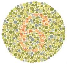
Do you see a number in this circle? If so, what is it?
(Again, scroll down for the “book answer.”)
|
|
|
|
|
|
|
|
Those with normal color vision should see the number 6 in the circle above.
Circle 3:
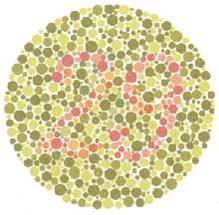
Do you see a number in this one? If so, what is it?
|
|
|
|
|
|
|
|
|
Those with normal color vision should see number 29. Those with red-green deficiencies should read number 70. Those with total color blindness will not see any number at all.
Circle 4:
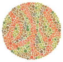
Do you see a number in this circle? If so, what is it?
|
|
|
|
|
|
|
|
|
This time the “book answer” takes a different turn. Those with normal color vision should not see any number at all. Most with red-green color deficiencies will see number 5. (Look back and check.)
More men than women have red-green color blindness. Studies are being conducted to determine whether a small number of women can actually perceive a wider range of hues.
Great painters, like Michelangelo
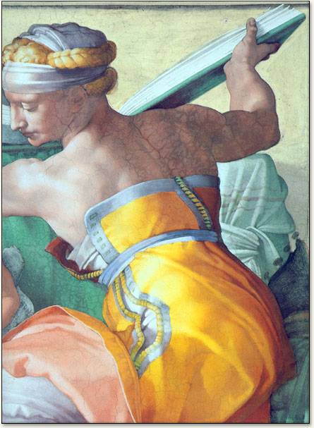
and VanDyck
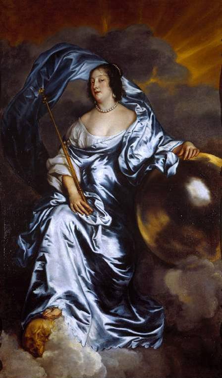
magically capture the way we perceive color and texture.
Da Vinci referred to “color theory” in his notebooks.
Sir Isaac Newton, based on his observations with a prism, developed this
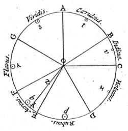
the first circular diagram of colors, in 1666, correlating colors with musical notes and symbols for the planets.
Goethe developed the color wheel below.
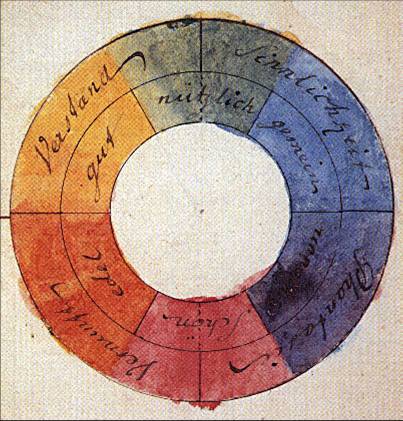
Scientists and artists have created many variations of this concept.
Although there are differences of opinion, any color wheel
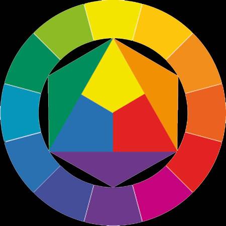
which presents a logically arranged sequence of pure hues has merit.
Today, art students learn color theory.
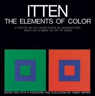
whether they are studying traditional media,
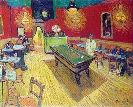
or web design.

But modern study may merely reflect what artists have known about color for millennia, without articulating or memorializing that knowledge except in their works.
This baby mummy in Urumchi, from 1,000 BC
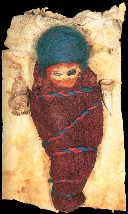
demonstrates that we may have an innate sense of color and color contrast.
In trying to analyze what made some rugs are more appealing than others, long ago, I sensed the importance of contrasts both of color and graphics, but had great difficulty expressing that sense until I became somewhat familiar with color theory.
I would have said that I was attracted to this Bordjalou Kazak horse cover
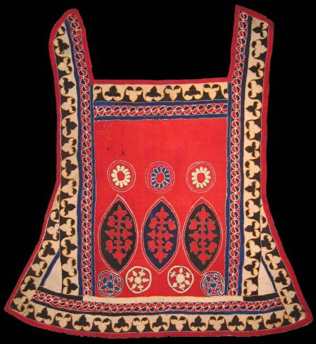
because it is bold, because the open red ground shows off the design elements in it, and because of the strong, but well-proportioned reciprocal border.
Now, I am more apt to think in terms of the vocabulary of the color theorists, that is, of contrasts of light and dark, of hue and proportion, and of complementary contrasts – concepts I’ll try to explain.

Recognizing these aspects of contrast, identified by Itten, a teacher at Bauhaus and a noted color theorist and author, should provide a better understanding of why you like or do not like a given rug.
“Contrast of light and dark” is the simplest of the contrasts to understand.
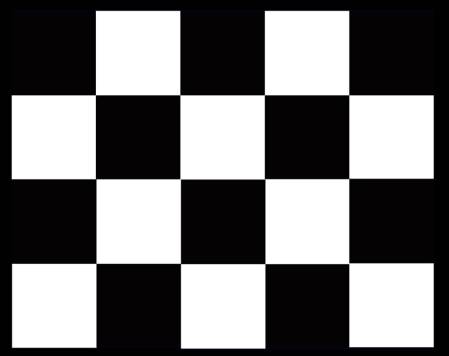

“Contrast of saturation” is a rather straightforward variation of “light and dark.”

![]()
Contrast of hues is also relatively easy to understand.
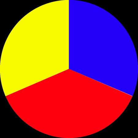
![]()
Red, yellow and blue are extreme instances of “hue contrast.” All other colors are derived from these three hues.
As you will see later, when these three colors adjoin, there are special perception issues.
Although there have been many scientific studies verifying the physiological effects of various colors, the “contrast of warm and cool” is the most difficult for me to demonstrate.
Blue-green is said the be the “coolest” color and red-orange is the “warmest.”

![]()
Van Gogh
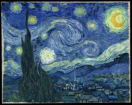
captured the coolness of the evening blue,
while Grunewald, in 1515,
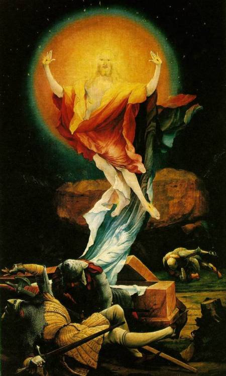
symbolically depicted a vibrantly living resurrected Christ with shades of orange and red.
The yastik on the left below has tremendous warm-cool contrast throughout,
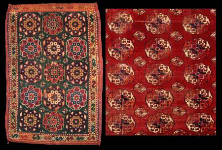
while the Salor on the right remains warm because of the dominant red. Note how a very comparable pattern yields two entirely different results because of the use of color.
Next we treat “complementary contrast.” (ed. notice the “e” after the “l.” This is not the same as a compliment that one person gives to another.)
All color wheels show the primary colors red, blue and yellow,

and those colors that are directly opposite one another are called “complementary” colors.
The further one moves away from a given point on the perimeter,
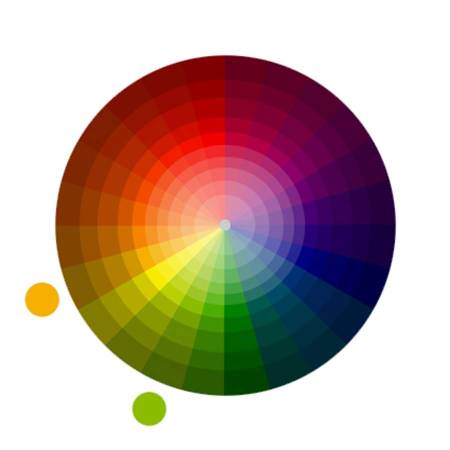
the greater
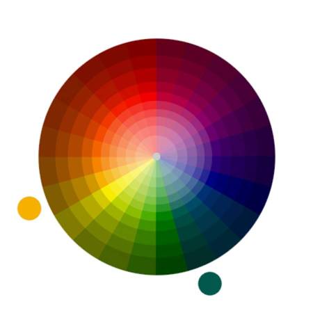 and greater
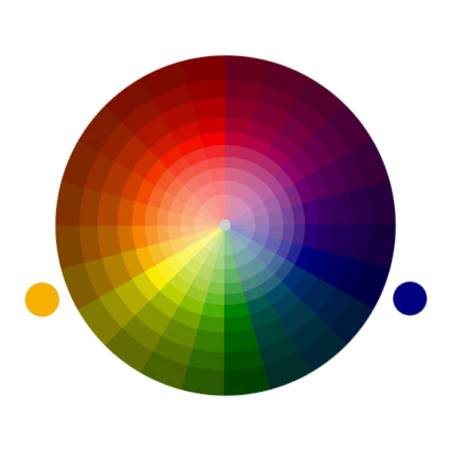 and greater the contrast becomes.
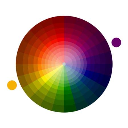 (Ed.: Color theorists usually designate colors close to one another on a color wheel as “analogous” and reserve “complementary” for those on the opposite side of the color wheel.)
To repeat the colors at the opposite points on the color wheel are the “complementary” colors.
Here are six examples of “complementary” colors.
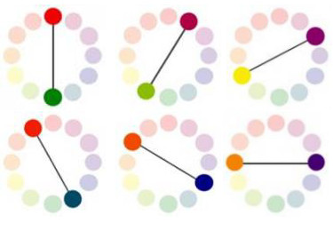
We perceive complementary colors as extremely high in contrast.
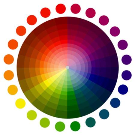
Just as high as “light and dark,”

although it may seem less obvious.
As to the physiological basis of complementary colors, you may be able to experience it if you do the following. First, look steadily for a few moments at the red circle that follows below. Then, move to the next black screen, stare at it, and see if you see an image on it.

Now stare at the black screen below.

You should now be seeing a color that is generated by the receptor rods in your eyes.
(Ed.: This effect may not occur in this medium but it did for this same image projected on a screen.)
If you saw a color when you moved your eyes to the black screen, it was probably something like this

Notice that this greenish blue is the complementary color of the red you stared at initially.
Next, stare at the black device in the center of the image below.
As you stare at the center, you may see a yellow ball rotating around the center, displacing the blue balls in rotation.
(Ed. Again, this effect may not occur in this medium, although it did dramatically with Wendel’s projected image. If you do not see motion, double click the image, which will cause it to open in a new tab and you should then see the motion. Read the directions for performing this test and then view the image in the new tab.)
Now, move your eyes out from the device at the center to the blue balls on the perimeter and move back and forth between them constantly. Try this before reading the next paragraph.
|
|
|
|
|
|
The yellow ball may disappear.
Now move your eyes back to the black device at the center and stare at it. The circulation of the yellow ball may resume. Keep staring at the center for while, then look steadily at the screen below.

When you look at this green screen after looking steadily at the center of the previous one, a circle of yellow balls appears. The cones in your eyes are transmitting green’s complementary color yellow. You likely see it for a moment, then it fades away.
(Ed. We did ourselves see this effect in this medium.)
Now let’s do some comparisons with images of actual rugs and textiles.
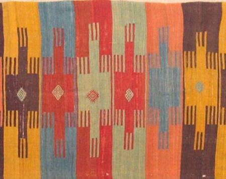
The image above is of an Anatolian kilim exhibited at the ICOC in Istanbul. It is relatively simple.
The fragment below
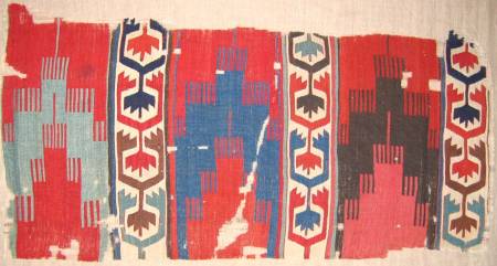
is of an early 19th century kilim, with decorated bands separating the panels. Like the previous kilim, it may be a multiple-niche “prayer” design or saph.
The individual hues in these kilims are all from natural dyes and equally attractive. But now I ask you to tell me which of the two you would prefer to have on your wall at home?
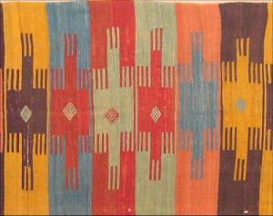
The one at the top or the one at the bottom?
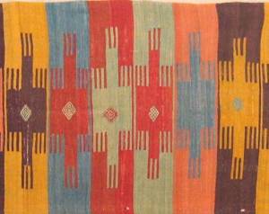
Here is a full-length image of this spectacular Anatolian kilim.

It is about 16 feet wide (as oriented in the above image) and dates possibly from the 17th century.
It may be a multiple-niche “prayer” design or saph, but the design is almost irrelevant. There are only a few repetitions of specific color combinations, but the combination and juxtaposition of colors is most important.
The adjacent ground colors and design colors have been woven in complementary colors,
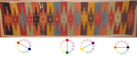
with the result that each hue is enhanced and made attractive by its neighboring color. This skillful use of complimentary color makes it my choice between these two.
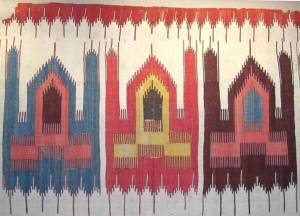
Next, we see a portion of an extraordinary kilim

depicting mosques and their minarets, but using strong complementary colors, this time with an ivory ground.
It looks, in the image above, as if the ground at the bottom is gray, but it is white and the darkening is the result of available light.
This kilim differs from the previous two in that all of the design elements in this one have been outlined in a dark color — a topic I’ll address later.
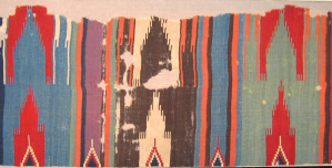
Here is a fragment of a kilim

that was probably similar to the preceding examples, but there are dividing stripes between the mosques in this example.
Here are the above two pieces together. Which of these two do you prefer? And why?

|
|
|
|
|
|
|
|
|
The colors are complementary in both, but the “mosques” kilim at the top has the added attraction of having contrast of light and dark as well as contrast of proportion (addressed below).
Contrast of proportion or extension influences the way we perceive colors and the ways in which colors appeal to us. In general, designs with significant contrast of proportion will be more appealing than those with little contrast of proportion.
Wendel then asked the audience to compare the two kilims that seemed favored in the first two comparisons and to express a further preference, if any. He asked whether the graphics of the mosques would be preferred over pure color.
|
|
|
|
|
|
|
|
|
The audience seemed divided and unable to select a preference between them. Wendel’s perspective was that he also couldn’t choose, that the complementary colors of the top kilim are compelling, but color alteration and dark and light contrast of the bottom piece have equal appeal.
Although my purpose, here, is not to discuss dyes, I want to use the two pieces below to make a point about “color balance” that is, in this instance, dye-related.
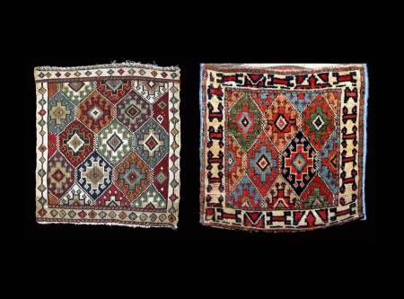
One problem with synthetic dyes is that, if the colors change as the fuchine dye in the reverse sumak on the left has, it completely changes the color balance. No such change has taken place in the pile bag on the right.
Synthetics are not necessarily bad. I’ve always assumed that the cotton cloth in this mola
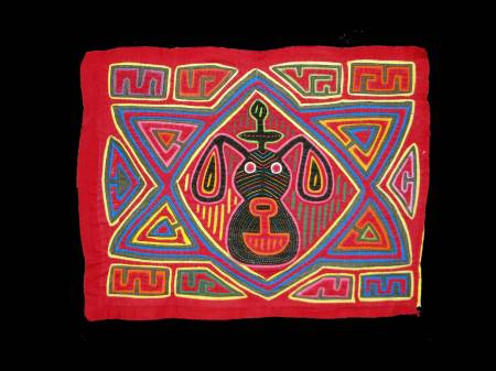
was dyed with chemicals, but the colors have not changed and the use of contrasting hues in this humble little reverse applique makes it very appealing. Especially since I paid only $3 for it in Cartegena in 1977.
Next we have two small pile rugs, each about 3 feet by 5 feet.
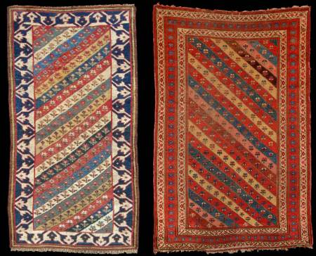
The one on the left is Caucasian or Northwest Persian and the one on the right is Kurdish from Northwest Persia. Both use diagonal stripes that have minimum floral decoration. I put it to you, which of these two do you prefer and why? Please evaluate these two pieces especially using Itten’s contrast of “proportion” or “extension.”
|
|
|
|
|
|
|
|
|
The simple way of putting it is that the one on the right is almost monochromatic. It lacks contrast of hue, proportion and complementary colors.
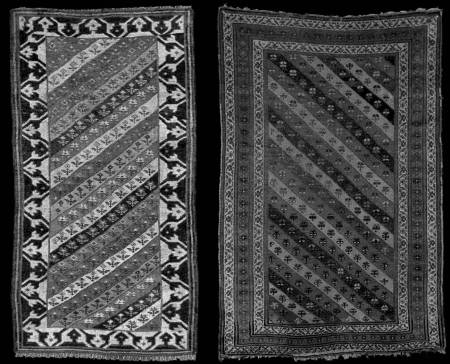
In addition, if we remove all the color
![]()
the bold reciprocal border is appealing even without it.
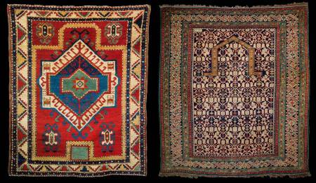
Below are two Caucasian rugs of approximately equal size, condition and age.

Which do you prefer? The one on the left? Or the one on the right?
|
|
|
|
|
|
|
|
|
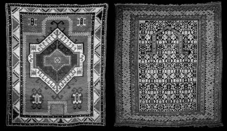
I expect that most prefer the one on the left. This preference is likely the result of the fact that the Fachralo, on the left, exhibits greater contrast of proportion (that is of scale or extension) than does the so-called Chi-Chi on the right.
![]()
In the Fachralo, there is greater contrast of proportion between the main border elements and those of the field. And the large, open field is proportionally contrasted with the medallion and field elements.
While the total amount of ivory, which always provides contrast, is approximately the same in each rug, the larger scale of the ivory areas in the Fachralo on the left makes it seem as if there is more ivory in it.
With the color withdrawn
![]()
we can see that the while the contrast of light and dark is about the same, it is the contrast of proportion that make the difference.
Their lack of contrast of proportion is why I think most Chi-Chis are duds.
Now, for the next few moments I want you to forget about cultural context. Tell me, solely on the basis of color, which of the two details below do you prefer?
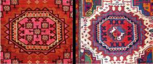
Do you prefer the one on the left or the one on the right? And why?
|
|
|
|
|
|
|
|
|

![]()
![]()
On the left is a Salor gul with the typical warm Turkmen reddish hues, while the one on the right is a very rare Karakalpak, using essentially the same Salor gul motif.
How do we evaluate the various contrasts in these two guls?

![]()
![]()
The Salor shows contrast of saturation as well as moderate light and dark contrast, while the Karakalpak has contrast of warm and cool hues, complementary contrast in addition to light and dark contrast and that of proportion.
So how, on balance, do we experience the overall effect of the various contrasts in these two guls? Is the Salor “subtle” or “boring?” Are the color contrasts of the Karakalpak “dynamic” or “garish?”
Or is the answer “all of the above?”
Our individual preferences might lead to a real food fight over the answers.
(Ed.: And notice how difficult it is, once the tribal labels are provided, to keep cultural context out of these evaluations.)
Now, look at the pair below.

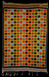
I collected the complete Ersari checkerboard rug on the left about four years ago because I was intrigued by its rarity and because I like checkerboards. Its colors, although good, were not compelling.
Now compare it with to the Qashqai kilim on the right, which has terrific contrast of hues. If anyone here were to prefer the Ersari, it would demonstrate that our collecting behavior is not always governed by the mantra of color, color, color.
Now, let me return to the Vaklifar rug that I have on my coffee mug.
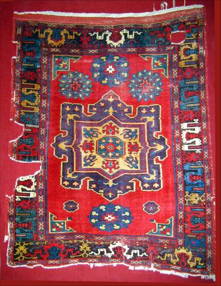
and compare it to a later Melez that has many good individual colors.
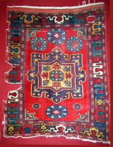
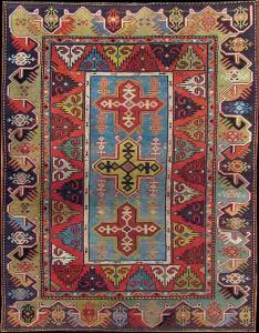
In the Vaklifar rug, on the left above, the scale of the central medallion is perfectly set off by the open red field. The cloudbands in the border have contrasting hues and the border itself is drawn in a smaller scale, thereby emphasizing the medallion.
The Melez, on the right above, lacks this contrast of proportion. Its design elements are all of about the same scale. Because we derive no sense of contrast of proportion, its attractiveness is diminished.
This lack of contrast of proportion in the Melez is made further apparent when it is compared to this Mudjur long rug
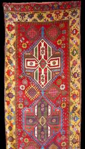
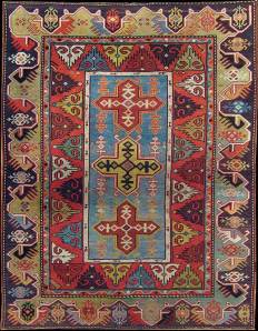
which has similar colors and design elements, but used entirely differently.
It is important to note that the various dimensions of contrast that Itten identifies can work both to support one another and so make a piece more aesthetically attractive, but there is discernible loss of appeal when one or more of such contrasts is lacking.
By comparing the two rugs below, you will see that the term contrast of proportion is more encompassing than just the scale of the drawing.
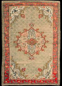
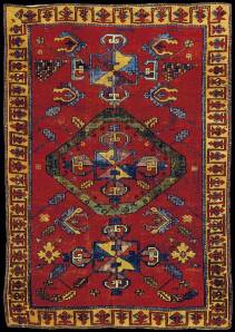
Note that the drawing and scale of these two pieces is nearly the same. The sizes of the meander borders are the same. The outline medallions are similar in scale. Why do we like the one on the right far more than the one on the left?
It is, I would argue, because the colors of the Oushak on the left lack contrast of proportion between the ground and the elements within it. On the other hand, the red ground of the early Anatolian rug on the right seems much larger in scale than the elements within it, thereby actually accentuating the small field elements.
The sickly colors in the Oushak may be from synthetic dyes, but more importantly, it is this fundamental lack of contrast that makes it so unappealing.
Further, the colors of the rug on the right seem “rich” to us because in addition to the contrast they have abundant complementary contrasts, hue contrasts, and contrasts of light and dark. This is “color, color, color.”
How many of you love cilantro?
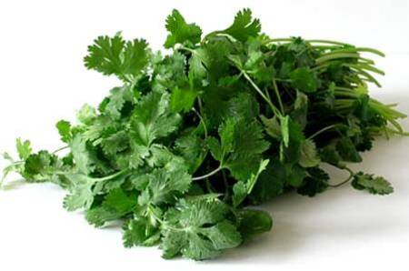
And how many swear it tastes like soapy dishwater?
Recent scientific studies have shown that the difference in reactions is due to whether one can or cannot discern certain components of its taste.
And so I believe it may be with color and contrast. Perhaps some don’t like color at all, especially bold colors.
Many home and rug owners prefer the “neutral” look
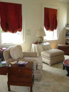
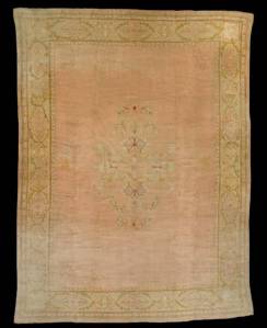
and essentially bland Oushaks fetch tens of thousands at auction.
Perhaps the market has revealed how much of a dunce I am

in talking about the importance of contrasts.
Woven in Isfahan during the reign of Shah Abbas I (1587-1629), the silk rug below
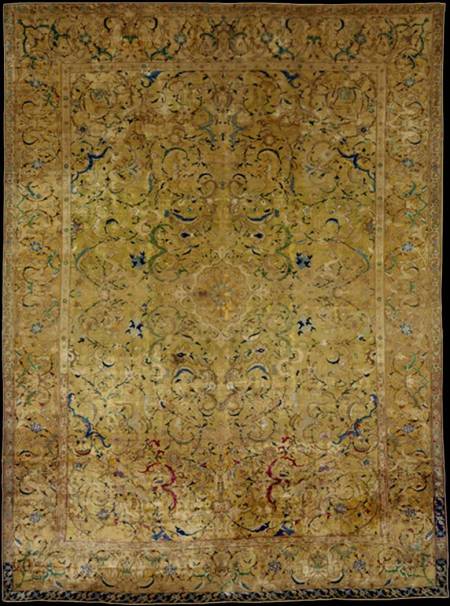
measures 7′ 7″ x 5′ 7″ and is reported to have 14 shades of color. I have difficulty seeing more than three.
Formerly in the collection of Doris Duke, it sold last year for almost $4.5 million.
While the comparison may not seem or even be fair, solely on the basis of these images,
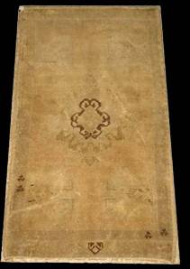


I find little more to admire in this Duke rug than I do in this bleached out yastik that was offered on eBay.
Although more contrast can be seen in a detail of the Duke rug
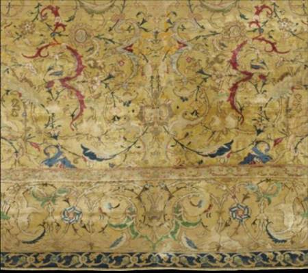
when I spend $4.5 million for a rug, I think I’ll insist on a bit more color.
The juxtaposition of colors can affect the way we see scale and proportion and h0w adjacent colors are perceived.
Look at the three squares below.
 The gray centers of all of these three squares are exactly the same size, but the yellow seems to compress the inner box while the red seems to expand it.
The fragment below is from a large, magnificent 16th century Mughal carpet.
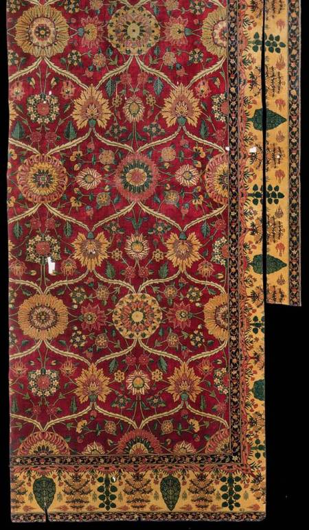
It is a perfect example of more being more. But its splendor can be better appreciated as we move closer.
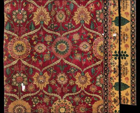
This rug was probably meant to be viewed and appreciated as you are seeing it in the image immediately above, but its real splendor can only be as we move in closer.

I saw this rug in the Metropolitan Museum in New York about 11 years ago, and consider it to be one of the most beautiful objects that I have ever seen.
There are contrasts of saturation, as seen in the different hues of blue, green and red and yellow. Part of the majesty of this rug is that so many colors were used. And they are all enhanced by being set against the rich, almost velvety, red ground.
It has wonderful complementary colors
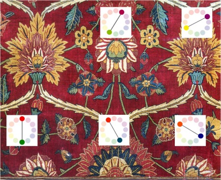
It also has superb contrast of light and dark.
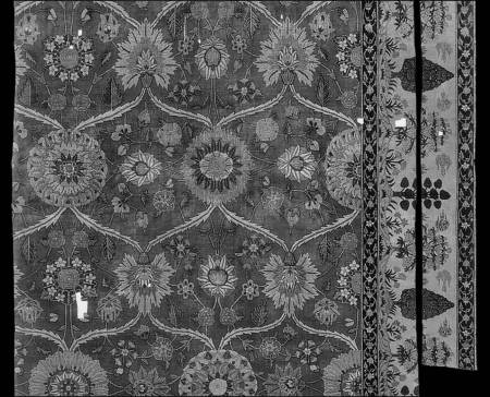
Note, in the image below, that the tendrils and all of the flower heads are outlined with a dark color,
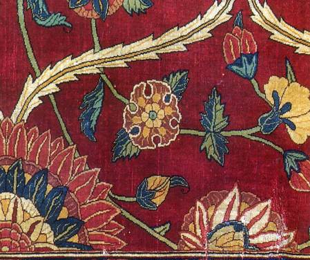
something that is a common weaving tradition.
That tradition can be seen in this Seljuk rug from the TIEM
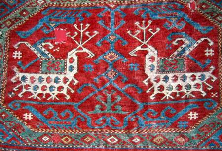
where the bodies and antlers are outlined as are the birds and the tree of life in the center.
Outlining is carried on in the 19th century yastik below.
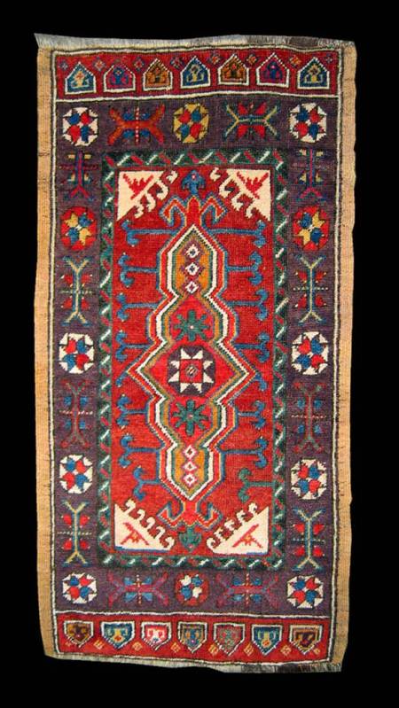
where even the outlines are outlined.
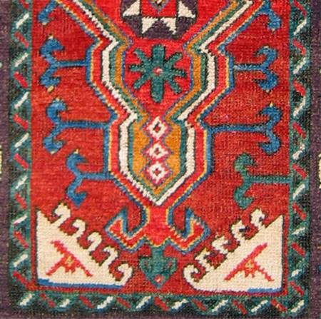
In Persia, the same is true of the Mazlaghan below.
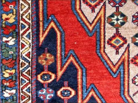
where, again, we see the outlining of outlining.
We see outlining in Northwest Persian rugs,
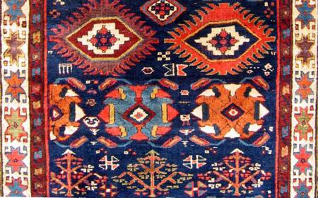
Belouch group rug and bags,
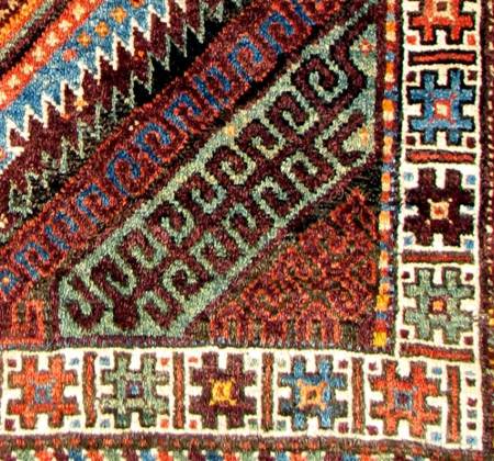
Turkmen
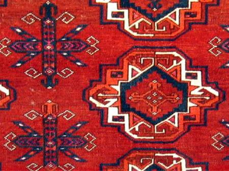
and Caucasian rugs,
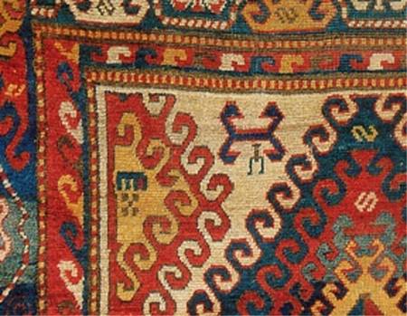
as well as sumak bags,
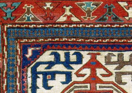
and in some Chinese rugs.
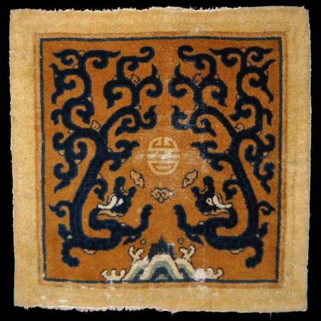
It doesn’t appear often in kilims,
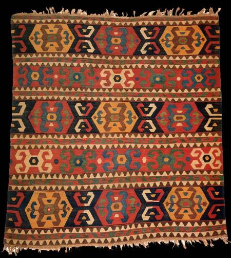
but we sometimes see it.
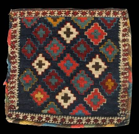
Just as with pile, there is no structural reason for outlining in a kilim.
Why, then, do we see outlining?
In some rugs, like this Persian fantasy carpet below
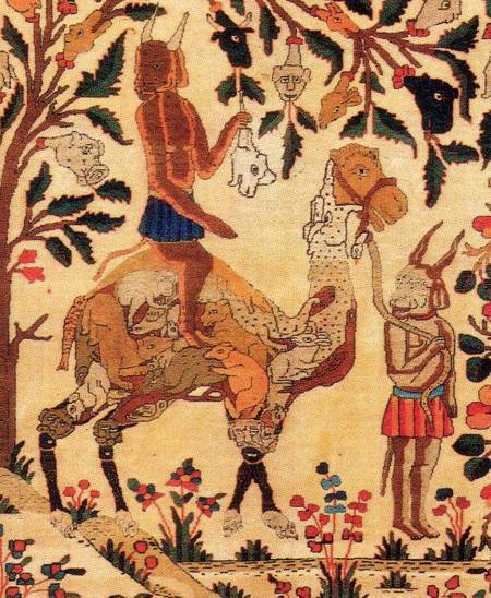
lines are used to create the image of some of the heads. But that does not explain why the multi-colored fruits and leaves are also outlined.
If we look at other media, we also see outlining, as in the Iznik tiles below
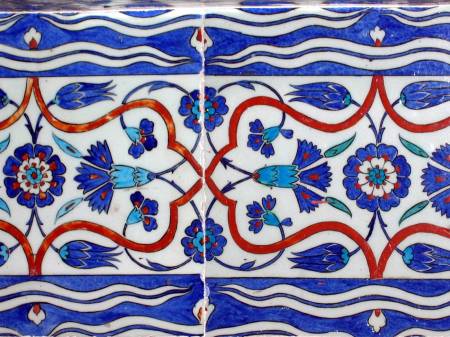
from the Rustem Pasha mosque in Istanbul. The argument could be made that the artist first outlined the pattern and then filled it in with colors.
But I believe that the practice of outlining can be explained by color theory.
Traditional, representational oil paintings did not employ outlining,
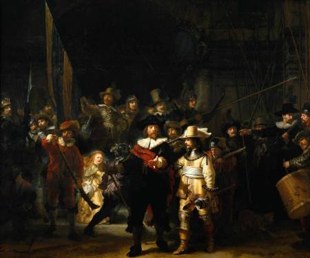
even though Rembrandt was a master of the contrast of dark and light.
But, from the Impressionist movement forward, it was color itself, not dukes and duchesses, angels and demons, with which artists were concerned.
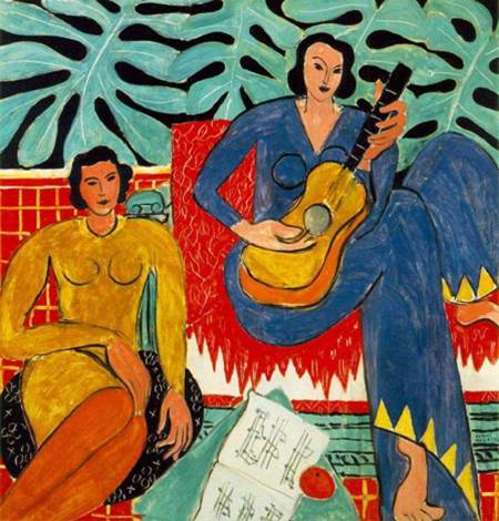
And so outlining can be seen in oil paintings over the last 150 years.
I asked George Jevremovic why his rugs, which so faithfully create the spirit of antique rugs,
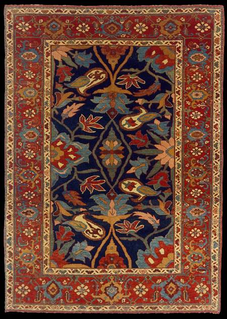
have outlining.
His answer, “Tradition, tradition,”

was, of course, 100% correct, but not quite what I was seeking.
Yes, outlining is a tradition, but why is it a tradition?
I believe that answer may lie in an another kind of contrast identified by color theorists that is deeply rooted in the past.
Here, below, is another $3 mola
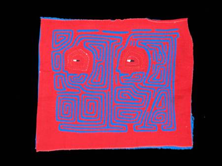
with the primary colors red and blue adjacent to one another and and of the same proportion.
Do you have trouble determining what is depicted?
Any two adjacent colors will change our perception of each of them as the result of the effects of “simultaneous contrast.”
Simultaneous contrast is an effect created by two adjacent colors interacting with one another to change our perception of them both. This effect is strongest when the two colors are primary hues of the same saturation and darkness.
By substituting green for blue
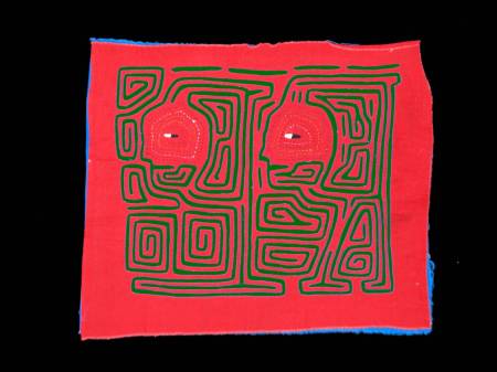
it may be easier to see that there are two warriors facing left.
Here are these two color combinations side by side. The warrior figures in green are now much easier to see.
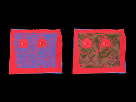
And if we remove the color from this pair,
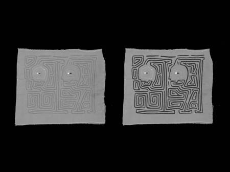
we can see that one reason why the blue-red image might be more difficult to discern than the green-red one, is that the light and dark contrast of the particular green-red hues are much greater than those of the blue-red image.
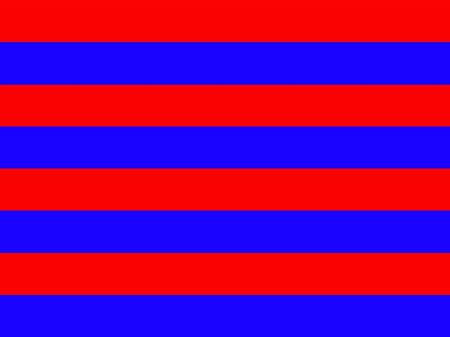
Let’s experiment with another example of this red-blue combination. Look at the image below steadily for awhile.
 |
|
|
|
|
|
|
|
|
|
When two primary colors are adjacent, our eyes have great difficulty determining where one color ends and the other begins.
The edge between the red and blue may almost vibrates and we begin to see black lines between the colors despite that fact than none exist.
For most of us, it may seem as if the red stripes are advancing toward us.
(Look back at the striped panel above and see what your experience is, then return to this place and go on.)
However, when the red and blue stripes are separated by a dark color,
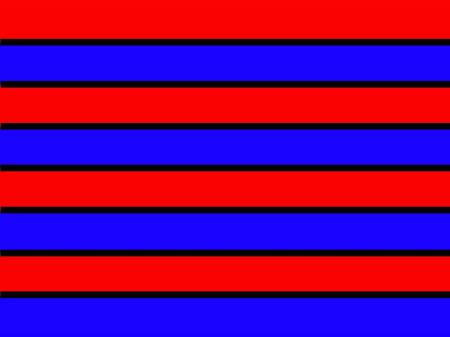
the red and blue lines appear sharper and less visually confusing.
I believe that the origin and purpose of dark color outlining is to prevent this visual confusion of adjoining colors.
Let me share a related experiment that makes the function of outlining clear. Below, are two outlines of the Mediterranean.
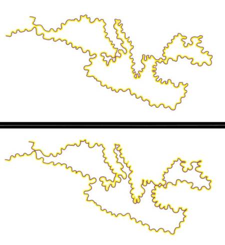
In the top version does either the water or the land mass seem to be tinged with a certain color?
And what about the bottom drawing? Is one or the other tinged?
Look back and consider your answers.
|
|
|
|
|
|
|
|
|
|
In fact, the water and the land are both pure white in both drawings, but the yellow outline is on the water side in the top and on the land side in the bottom.
Our perception makes the yellow seem to bleed into the adjacent white and this may account for the ancient technique of using outlining to prevent the perception of color bleed.
Leonardo Da Vinci said: “Colors will appear what they are not, according to the ground that surrounds them.”
I recently encountered the thought below in Hofstader’s “Godel, Escher and Bach,” a la Lewis Carroll.
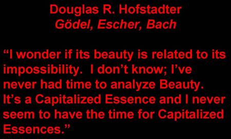
I don’t know whether we can analyze beauty or any Capitalized Essence. But, as we conclude, I’ll show three more examples of the application of color theory to what we enjoy about rugs.
I was only able to capture the detail below
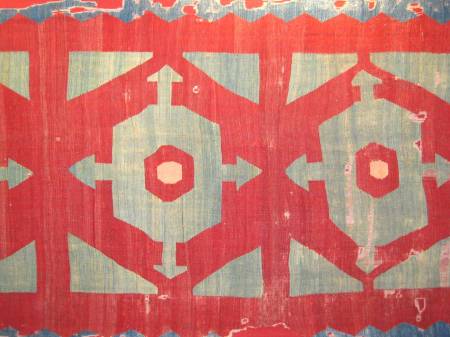
of a very large and very old kilim in what is the “new” Vaklifar in Istanbul. Do any of you recall seeing it at the ICOC?
The individual hues of greenish blue and red are both decidedly variegated and not particularly saturated. Some might argue that this is not the highest achievement of the dyer’s art, but the complementary colors alone

create a stunning and memorable image.
And the contrast of proportion and overall scale make it one that I remember most from that conference.
Although far less sophisticated, it has a feeling that is similar
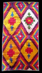
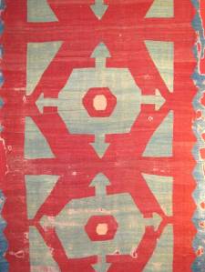
to the silk velvet ikat I showed earlier.
Perhaps we should think in terms of a new mantra.


So that the next time you’re attracted, as almost all of us are, by a wonderful purple in a rug,
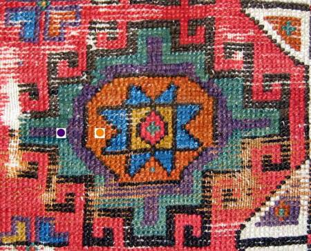
you may notice its context and whether it is in juxtaposition with its complementary color, gold.
And when you see a rug that you really like,
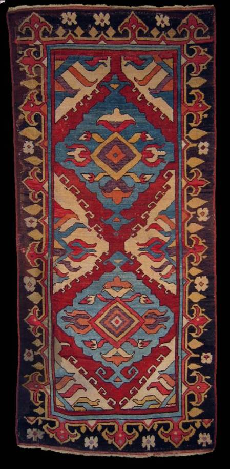
ponder its Capitalized Essences and ask yourself why.
Is it because of the “complementary contrasts” or the “contrast of hues?” Or is it because of the “contrast of light and dark” or the “contrast of proportion?”
Or is it, as it is for me with this example … all of the above?
And so,

let’s look at some rugs.”
This is the end of this virtual version of Wendel’s lecture. He had also brought in some pieces to illustrate selected points in it.
To see these, and the related pieces that members of the audience had brought in, use the link below:
https://rjohnhowe.wordpress.com/2010/02/10/color-in-oriental-rugs-and-textiles-part-2/
R. John Howe


You must be logged in to post a comment.